CSS Grid is a powerful layout system available in CSS, designed to provide a more efficient way to create complex web layouts. Unlike Flexbox, which is one-dimensional (handles either rows or columns), CSS Grid is two-dimensional, allowing you to work with both rows and columns simultaneously. In this guide, we’ll explore the basics of CSS Grid, its key properties, and provide a handy cheat sheet for quick reference.
What is CSS Grid?
CSS Grid Layout, or simply Grid, is a layout system that provides a way to control the design of web pages using a grid-based approach. It allows for more complex layouts compared to other layout methods, offering flexibility and control over both rows and columns.
Basic Concepts
Before diving into properties and examples, let’s cover some basic concepts:
- Grid Container: The parent element that holds the grid items. It is defined by setting the
displayproperty togridorinline-grid. - Grid Items: The child elements within the grid container.
Grid Container Properties
1. display: grid
To enable CSS Grid, you need to set the display property of the container to grid:
.container {
    display: grid;
}
2. grid-template-columns and grid-template-rows
These properties define the number of columns and rows in the grid, and their sizes:
.container {
    display: grid;
    grid-template-columns: repeat(3, 1fr); /* 3 equal columns */
    grid-template-rows: auto 200px 100px; /* 3 rows with varying heights */
}
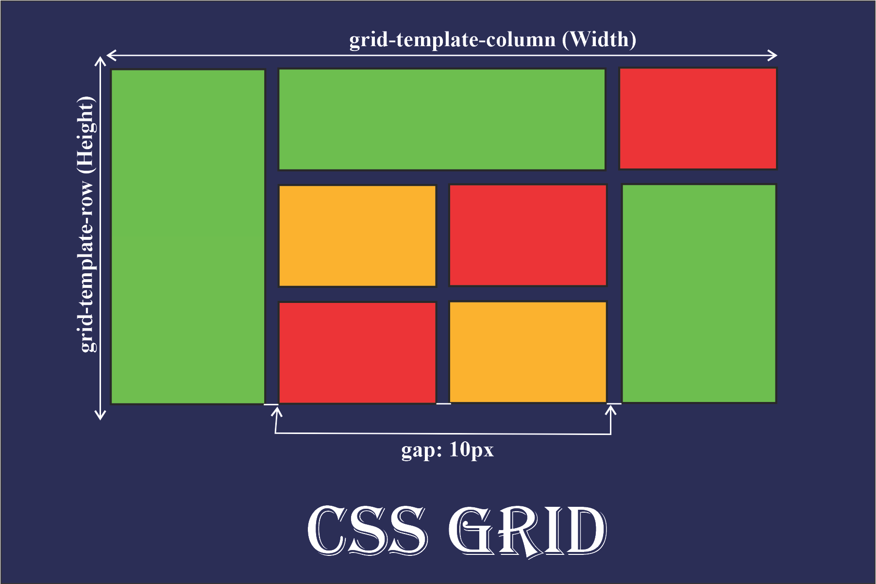
3. gap
The gap property sets the spacing between rows and columns. You can also use column-gap and row-gap for more specific control:
.container {
    gap: 10px; /* 10px gap between rows and columns */
}
4. grid-template-areas
The grid-template-areas property defines named grid areas within the container:
.container {
    display: grid;
    grid-template-areas:
        "header header header"
        "sidebar main main"
        "footer footer footer";
}

.header {
    grid-area: header;
}

.sidebar {
    grid-area: sidebar;
}

.main {
    grid-area: main;
}

.footer {
    grid-area: footer;
}
5. justify-items and align-items
These properties align grid items within their grid areas:
.container {
    justify-items: center; /* Align items horizontally to the center */
    align-items: center; /* Align items vertically to the center */
}
6. justify-content and align-content
These properties align the entire grid within the container:
.container {
    justify-content: center; /* Center the grid horizontally within the container */
    align-content: center; /* Center the grid vertically within the container */
}
Grid Item Properties
1. grid-column and grid-row
These properties define the start and end positions of grid items:
.item {
    grid-column: 1 / 3; /* Start at column 1 and end at column 3 */
    grid-row: 2 / 4; /* Start at row 2 and end at row 4 */
}
2. grid-area
This property assigns a grid item to a named grid area:
.item {
    grid-area: header; /* Place the item in the "header" grid area */
}
3. justify-self and align-self
These properties align individual grid items within their grid areas:
.item {
    justify-self: end; /* Align the item to the end horizontally */
    align-self: start; /* Align the item to the start vertically */
}
Cheat Sheet
Grid Container Properties
display: grid | inline-gridgrid-template-columns: repeat(auto-fill, minmax(100px, 1fr))grid-template-rows: 100px auto 100pxgap: 10pxgrid-template-areas: "header header header" "sidebar main main" "footer footer footer"justify-items: start | end | center | stretchalign-items: start | end | center | stretchjustify-content: start | end | center | stretch | space-between | space-aroundalign-content: start | end | center | stretch | space-between | space-around
Grid Item Properties
grid-column: 1 / span 2grid-row: 2 / span 3grid-area: headerjustify-self: start | end | center | stretchalign-self: start | end | center | stretch
Practical Example
Example: Basic Grid Layout
<div class="container">
    <div class="item header">Header</div>
    <div class="item sidebar">Sidebar</div>
    <div class="item main">Main Content</div>
    <div class="item footer">Footer</div>
</div>
.container {
    display: grid;
    grid-template-columns: 1fr 3fr;
    grid-template-rows: auto 1fr auto;
    grid-template-areas:
        "header header"
        "sidebar main"
        "footer footer";
    gap: 10px;
}

.header {
    grid-area: header;
}

.sidebar {
    grid-area: sidebar;
}

.main {
    grid-area: main;
}

.footer {
    grid-area: footer;
}

.item {
    background-color: #f0f0f0;
    padding: 20px;
    border: 1px solid #ccc;
}